orange county creamery

Premium ice cream shop in Orange County, California

the approach

The client had an existing logo with local recognition but lacked a cohesive brand system. The goal wasn't to redesign the identity from scratch, it was to evolve the brand through packaging, merchandise, and supporting graphics while respecting the equity already built into the existing logo.

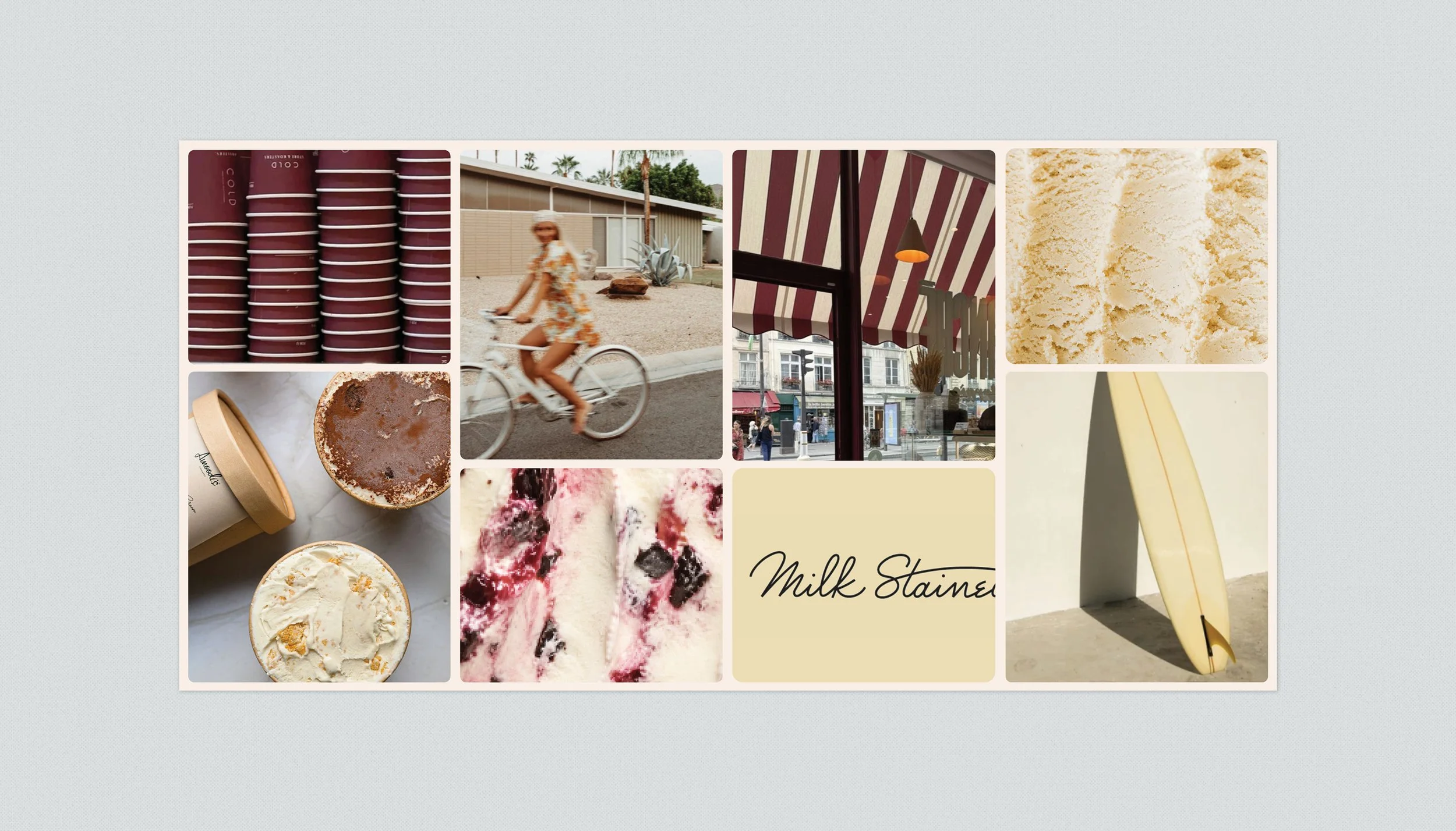
Rather than beginning with execution, we first established the visual direction through a mood board to define the personality the brand should embody before designing any applications.

Expanding the Identity

AFTER

  • Icon and wordmark became independent brand assets.

  • Introduced a signature accent color and custom icons.

  • Created a cohesive visual language that could extend across cups, pints, apparel, and marketing materials.

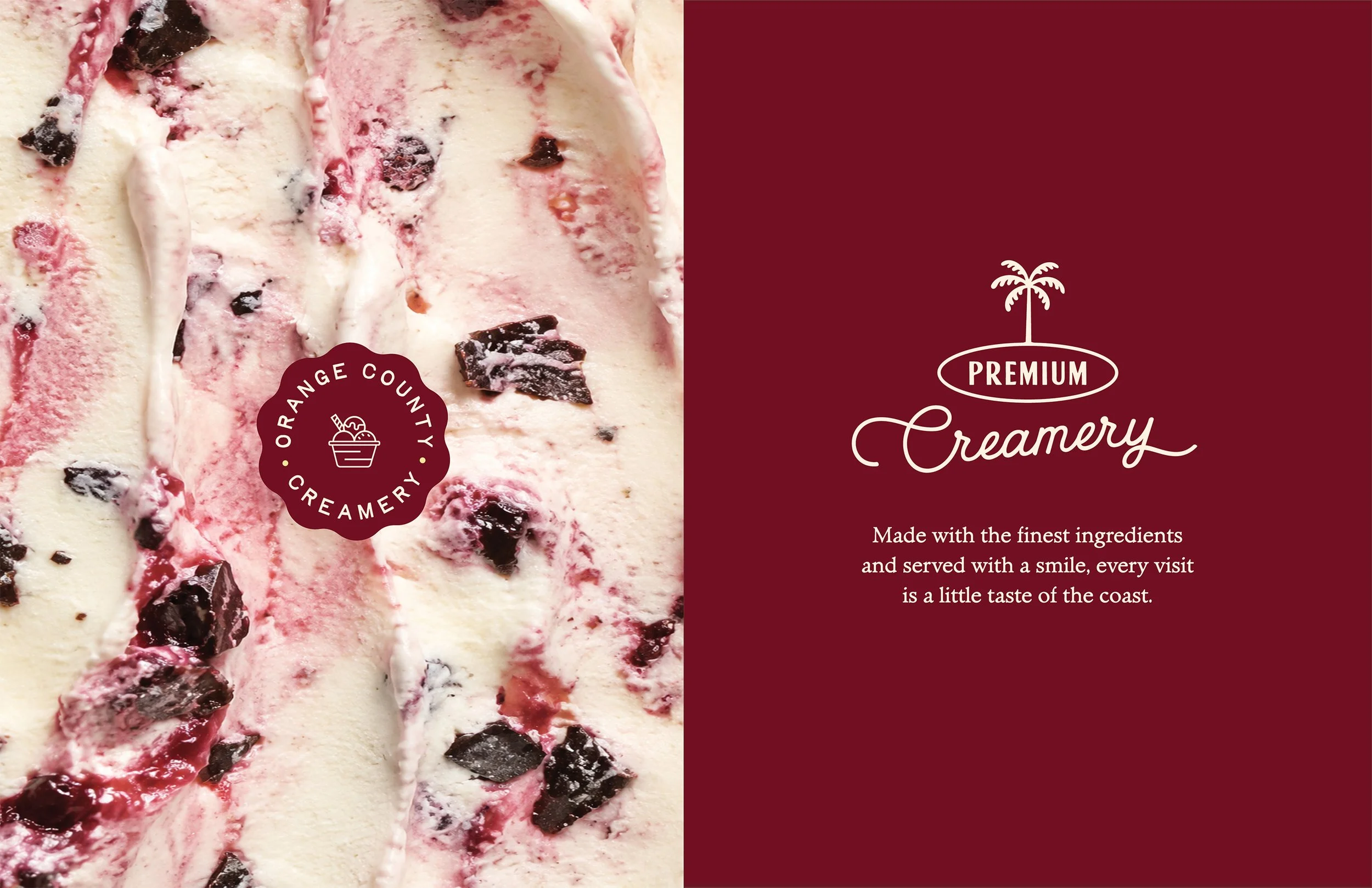
Rather than redesigning the logo, we expanded how it could work. Separating the icon from the wordmark created a more flexible visual system that felt fresh while preserving the familiar elements customers already recognized.

BEFORE

  • Logo always contained within a square.

  • Limited flexibility across different applications.

  • Packaging relied almost entirely on the logo for recognition.

Exploring the Possibilities

Several packaging systems were presented, ranging from a more heritage-inspired direction to a brighter, more contemporary approach. While the client ultimately chose a more conservative evolution, these explorations helped define what felt authentic to the brand and informed the final direction.

The Final Direction

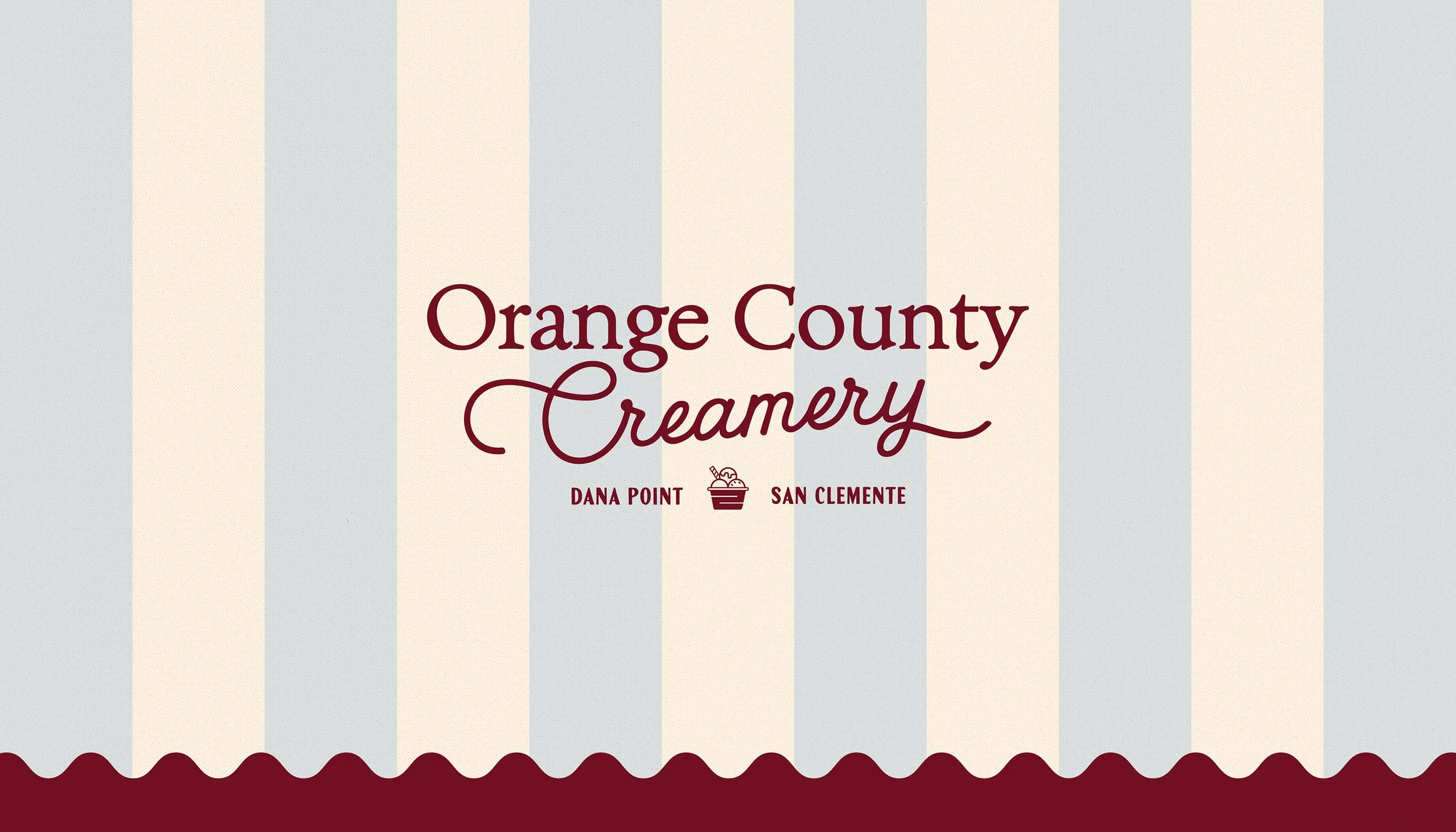
Rather than introducing a completely new identity, the final solution focused on evolving the existing brand. A new signature color, custom icons, and an expanded visual system provided greater consistency across packaging and merchandise while preserving the logo customers already recognized.

Rather than replacing the existing logo, the goal was to build around it. By preserving the equity of the mark customers already recognized while introducing a more flexible visual language, the identity could begin to extend naturally across packaging, merchandise, and marketing materials.

Separating the icon from the wordmark, introducing a signature accent color, and developing a library of supporting icons transformed a single logo into a cohesive brand system—one that felt fresh, recognizable, and adaptable across every customer touchpoint.

Previous
Previous

Gyro Republic

Next
Next

Tasso Bistro