orange county creamery

Evolving an established identity into a more complete brand.

THE GOAL

the challenge

Orange County Creamery already had a recognizable logo and an established presence in its community. What it didn't have was a broader visual system to support the brand as it grew.

The existing identity relied heavily on the logo, limiting how the brand could show up across packaging, merchandise, marketing, and the overall customer experience.

the approach

Rather than replacing what customers already recognized, we focused on building around it.

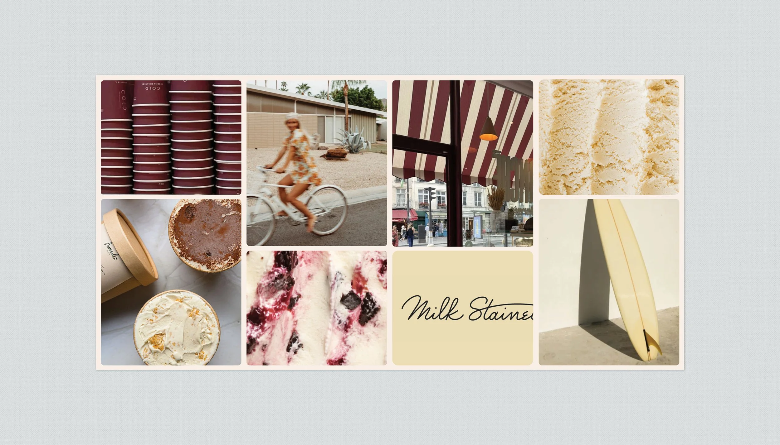
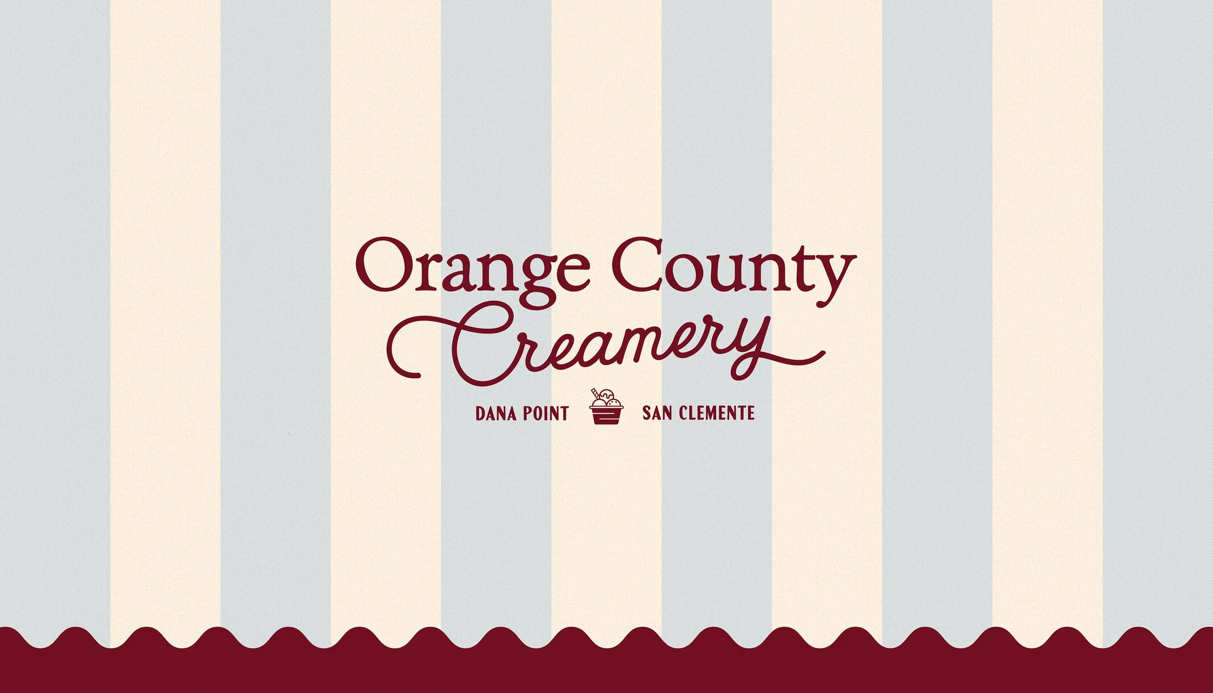
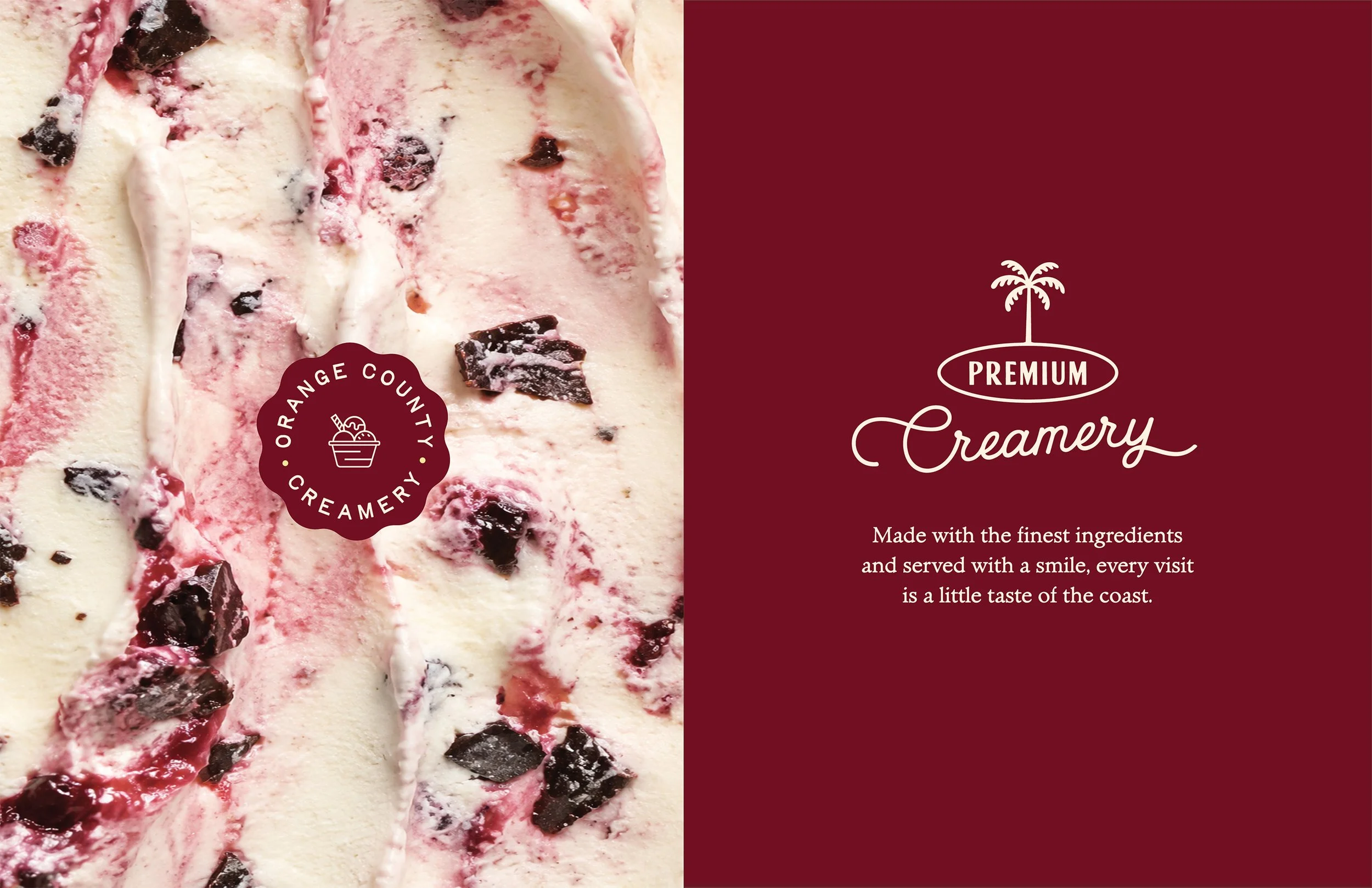
We began by establishing a visual direction that captured the personality of the brand, then expanded the existing identity into a more flexible system. The icon and wordmark were given room to work independently, while a signature color, custom illustrations, typography, and supporting graphics created more ways for the brand to express itself.

The goal was to make Orange County Creamery feel more distinctive and cohesive without losing the familiarity and equity it had already built.

the result

A more complete brand system that feels fresh, recognizable, and unmistakably Orange County Creamery.

What began as a single logo became a flexible visual language that could extend naturally across cups, pints, apparel, signage, digital marketing, and future brand touchpoints—giving the business room to grow while still feeling like the brand its customers already knew.

Previous
Previous

Gyro Republic

Next
Next

Tasso Bistro